
Annual General Meeting 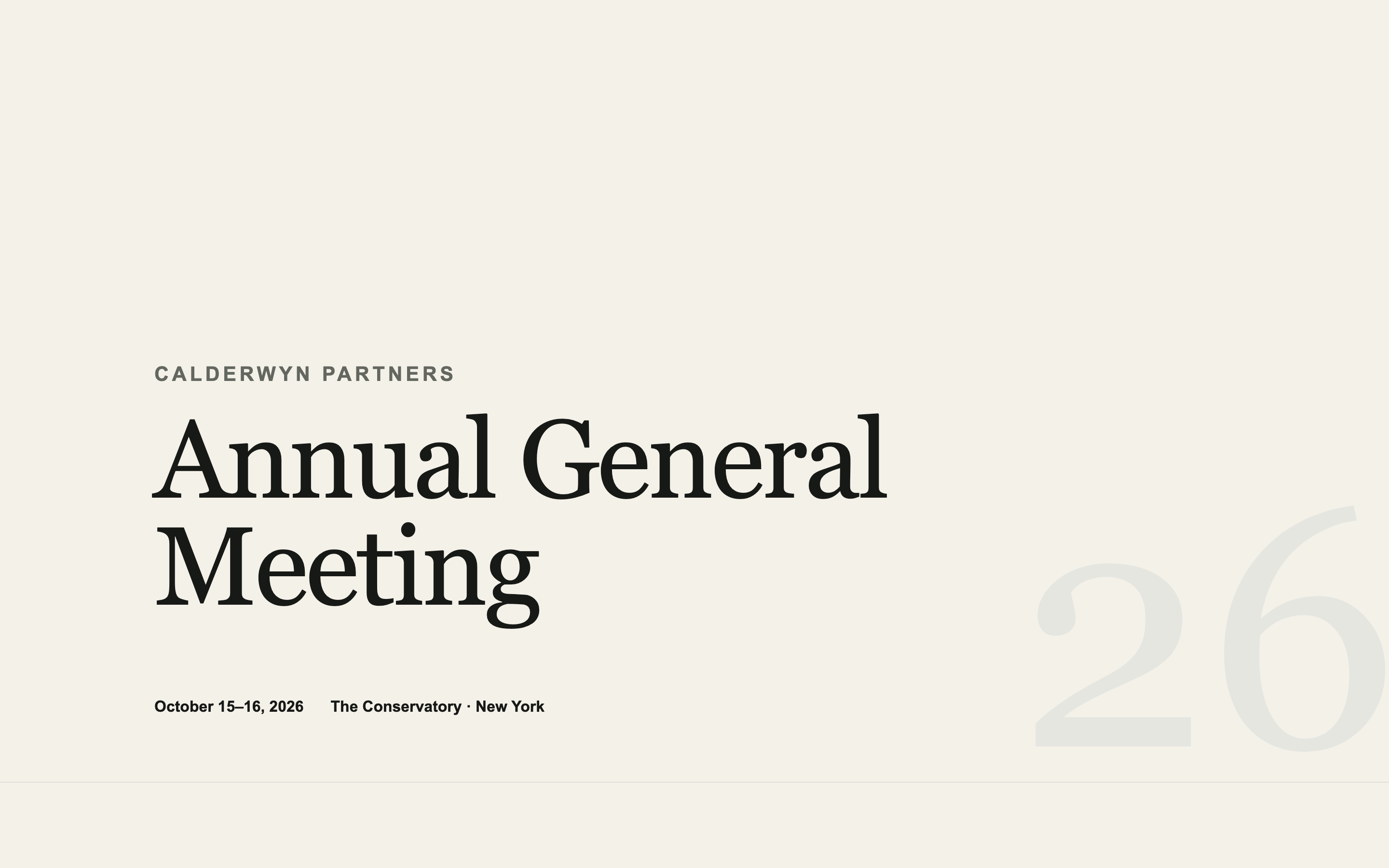
Annual General Meeting
An institutional AGM page — agenda, speakers, logistics, and travel — designed to look like the firm spent money on it without looking like marketing.
Landing Page Prompts
A black-tie benefit page with an honoree spotlight, tiered sponsor recognition, and table pricing — formal without tipping into ornate.
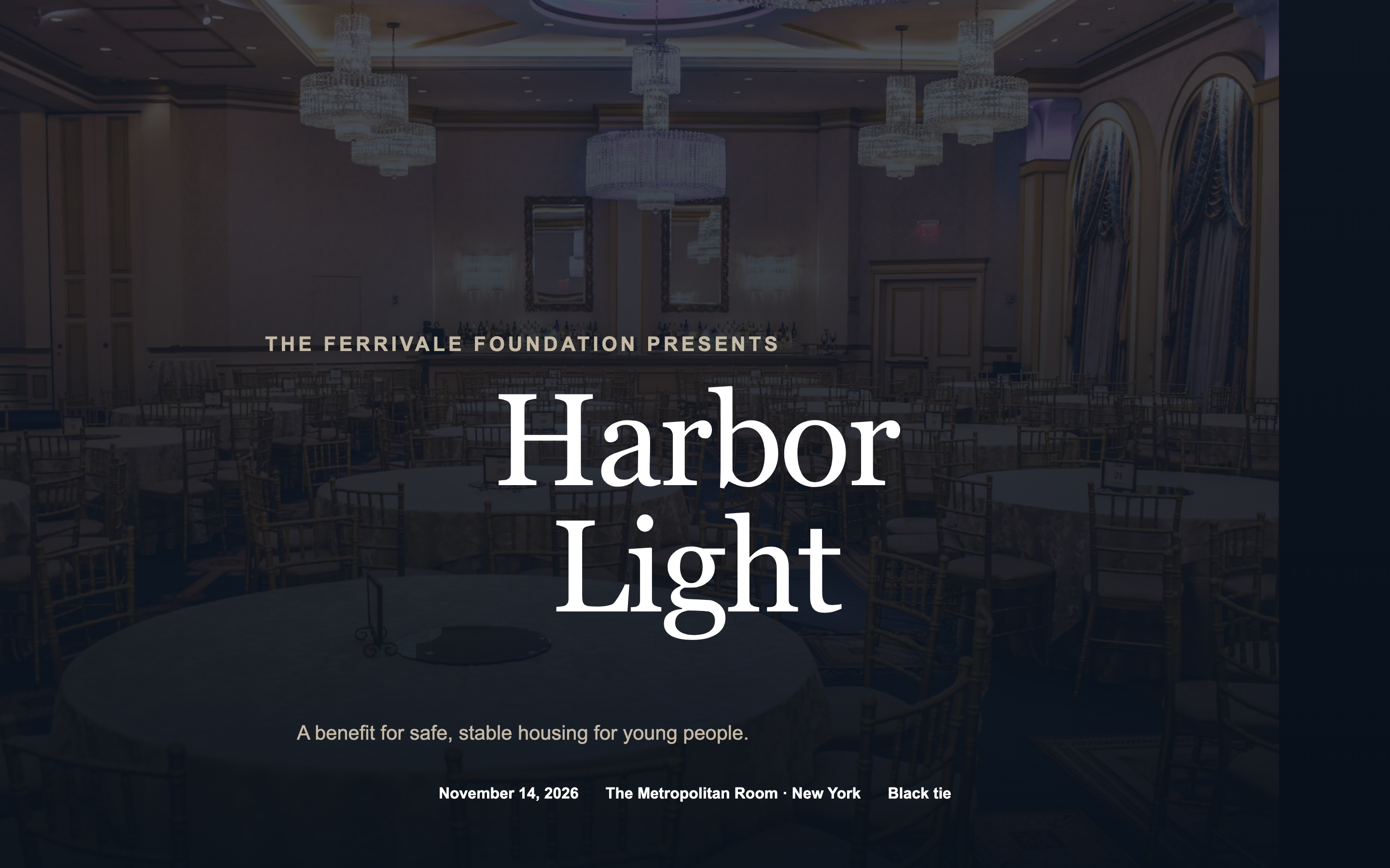
The one page in this set where a degree of ceremony is correct rather than a mistake. Dark palette, formal typography, and real hierarchy in the sponsor recognition — because for a benefit, that recognition is part of what was sold.
Create a landing page for [EVENT NAME], a black-tie benefit hosted by [YOUR ORGANISATION] on [DATE] at [VENUE, CITY], supporting [CAUSE].

Sections:

1. A dark, full-bleed hero — venue or a past event photograph, dimmed — with the event name in elegant type, the date, and the venue. Formal, not ornate.
2. A short statement on the cause and what the evening funds. Three or four sentences. Concrete about impact, free of charity-appeal clichés.
3. HONOREE SPOTLIGHT — a portrait, name, title, and two paragraphs on why they're being honoured. Give this real space; it's often why people come.
4. The evening's shape: reception, dinner, the programme, any performance. A vertical timeline rather than a table.
5. Table and ticket recognition levels, as cards in ascending order — level name, price, and what's included. Make the differences legible at a glance. Do NOT add a purchase or reserve button; Gatsby handles that.
6. Sponsor recognition in clear tiers, with visibly different logo sizes per tier.
7. A committee or host list — names and affiliations, set as a clean multi-column list.
8. Practicalities: dress code, arrival, parking and valet, accessibility.
9. Footer with a contact email placeholder.

Design direction: formal and warm. Dark background — near-black or deep navy — with cream or gold type. A high-contrast serif for headings. One metallic accent, used sparingly on rules and level names.

Elegant, not Victorian. No ornamental flourishes, no script fonts, no filigree borders. The restraint is what makes it read as expensive.

Motion: a slow fade-up on each section, and a gentle parallax on the hero. Nothing that draws attention to itself.

Ensure every text-over-image combination clears WCAG AA contrast. Dark galas fail this constantly and the copy becomes unreadable on a phone in sunlight.

Two requirements that govern how this page will be used:

FIRST — this page will be embedded inside a Gatsby event page, which supplies its own RSVP frame on top of it. So:

- Do NOT include any RSVP button, register button, ticket link, "reserve your spot" call to action, or registration form. Gatsby provides all of that.
- Do NOT include a contact form, a newsletter signup, or an email capture of any kind.
- Do NOT include a sticky header or floating action button that could collide with the RSVP frame overlaid on top.
- Leave roughly 120px of clear vertical space at the very bottom of the page so the Gatsby RSVP frame has somewhere to sit without covering content.

If a section feels like it needs a call to action, end it with a line of text instead — the Gatsby frame is the button.

SECOND — publish it to a public URL that requires no login, no password, and no invitation. I need to open it in a fresh incognito window and see the whole page with no wall of any kind, because it has to load inside an iframe.

Do not enable any preview password, access gate, or authentication. If your platform sets a Content-Security-Policy with `frame-ancestors 'none'`, remove it or change it to `frame-ancestors 'self' https://gatsby.events` — otherwise the page will refuse to load inside Gatsby.

Build requirements:

- Fully responsive, designed mobile-first. Most guests open event pages on a phone.
- No horizontal scrolling at any width from 320px up.
- Real, specific placeholder copy throughout — never lorem ipsum. I need to see how actual text sits in the layout.
- Descriptive alt text on every image.
- Keep it fast. Avoid heavy video backgrounds and multi-megabyte hero images; this loads inside another page.
- Respect prefers-reduced-motion for any animation.
An institutional AGM page — agenda, speakers, logistics, and travel — designed to look like the firm spent money on it without looking like marketing.
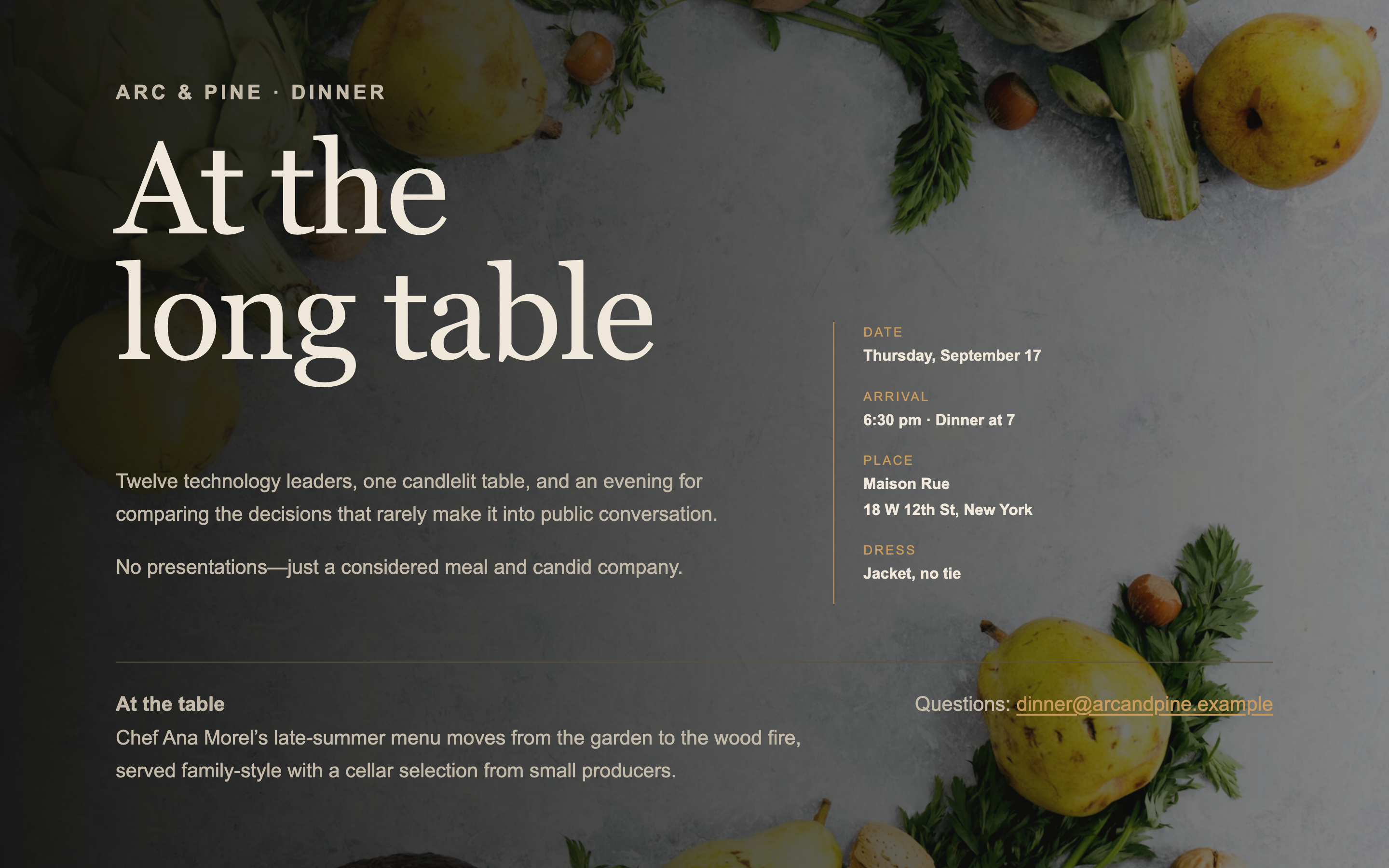
A single-screen page for an intimate dinner — venue, chef, and the shape of the evening. No scrolling, no agenda, no filler.
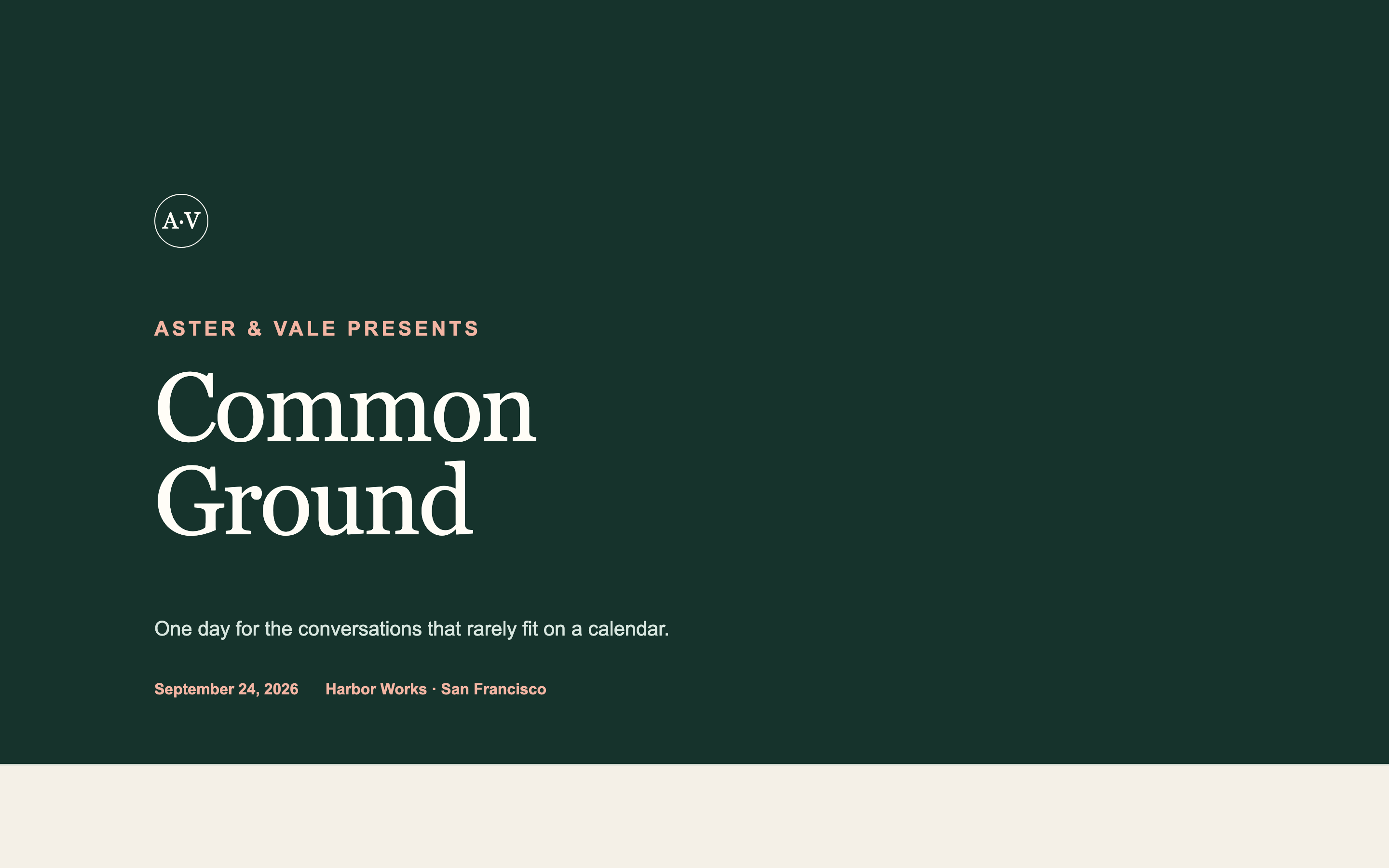
Takes your existing logo, colours, and typefaces as input and produces an event page in your firm's identity rather than a generic template.
Built something like this on Gatsby? We'd like to feature it.