
Bring Your Own Brand 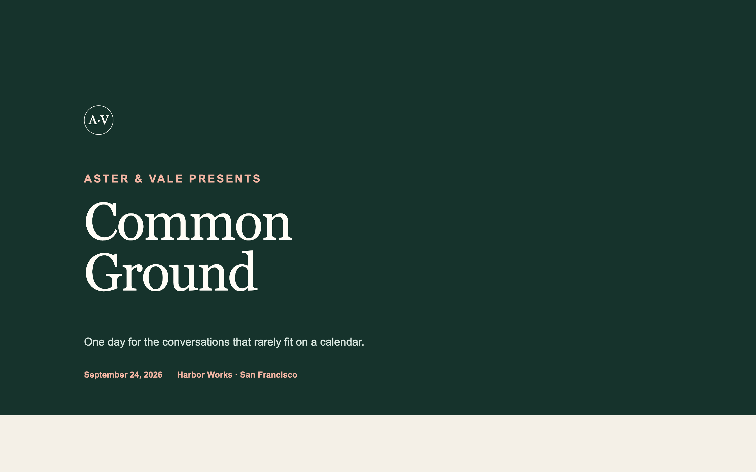
Bring Your Own Brand
Takes your existing logo, colours, and typefaces as input and produces an event page in your firm's identity rather than a generic template.
Landing Page Prompts
An institutional AGM page — agenda, speakers, logistics, and travel — designed to look like the firm spent money on it without looking like marketing.
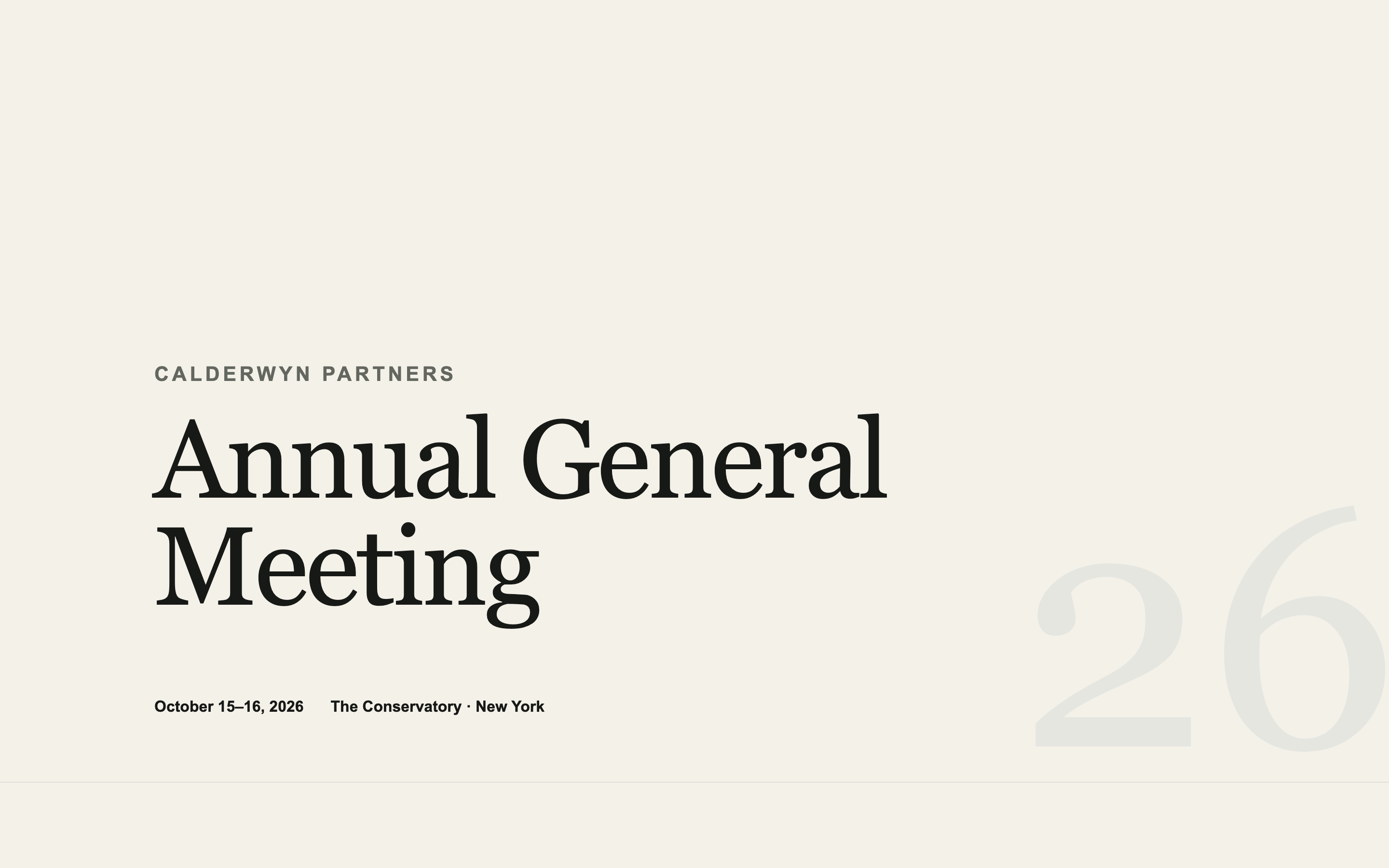
The highest-stakes page most firms publish. Attended by the people who fund them, and judged accordingly.
Built on restraint. The design signal here is that nothing is trying too hard.
Create a landing page for the [YEAR] Annual General Meeting of [YOUR FIRM], for [limited partners / shareholders / members], held [DATES] at [VENUE, CITY].

Sections, in order:

1. A typographic hero — firm name, "Annual General Meeting", the year, dates and venue. No stock photography. If there's an image, make it the venue or the city, treated quietly.
2. A short welcome from [NAME, TITLE], three or four sentences. Measured. This sets the tone for everything below.
3. The agenda, day by day, as a clean time-and-session table. Each session: time, title, and a one-line description. Speaker names link down to their bios.
4. A speakers section — portrait, name, title, firm, and a 40-word bio. Grid on desktop, stacked on mobile.
5. Venue and logistics: address, a map image placeholder, arrival guidance, parking, and dress code.
6. Travel and accommodation: recommended hotels with a booking-code placeholder, nearest airports, ground transport.
7. A short FAQ — five or six questions covering guests, dietary requirements, materials, and recording policy.
8. A quiet footer: firm name, a contact email placeholder, and the year.

Design direction: institutional and confident. A serif for headings — something with editorial authority rather than decoration — and a clean sans-serif for body. Near-black on off-white. ONE accent colour, [#HEX], used only for links and section rules. No gradients, no drop shadows, no rounded cards, no icon sets.

Whitespace is the primary design tool. Sections should breathe. Wide margins, generous line-height, and a comfortable measure — roughly 65 characters — on body text.

The one permitted flourish: a subtle fade-and-rise as each section enters the viewport. Nothing more. It should feel like a well-set annual report, not a website.

Two requirements that govern how this page will be used:

FIRST — this page will be embedded inside a Gatsby event page, which supplies its own RSVP frame on top of it. So:

- Do NOT include any RSVP button, register button, ticket link, "reserve your spot" call to action, or registration form. Gatsby provides all of that.
- Do NOT include a contact form, a newsletter signup, or an email capture of any kind.
- Do NOT include a sticky header or floating action button that could collide with the RSVP frame overlaid on top.
- Leave roughly 120px of clear vertical space at the very bottom of the page so the Gatsby RSVP frame has somewhere to sit without covering content.

If a section feels like it needs a call to action, end it with a line of text instead — the Gatsby frame is the button.

SECOND — publish it to a public URL that requires no login, no password, and no invitation. I need to open it in a fresh incognito window and see the whole page with no wall of any kind, because it has to load inside an iframe.

Do not enable any preview password, access gate, or authentication. If your platform sets a Content-Security-Policy with `frame-ancestors 'none'`, remove it or change it to `frame-ancestors 'self' https://gatsby.events` — otherwise the page will refuse to load inside Gatsby.

Build requirements:

- Fully responsive, designed mobile-first. Most guests open event pages on a phone.
- No horizontal scrolling at any width from 320px up.
- Real, specific placeholder copy throughout — never lorem ipsum. I need to see how actual text sits in the layout.
- Descriptive alt text on every image.
- Keep it fast. Avoid heavy video backgrounds and multi-megabyte hero images; this loads inside another page.
- Respect prefers-reduced-motion for any animation.
Takes your existing logo, colours, and typefaces as input and produces an event page in your firm's identity rather than a generic template.
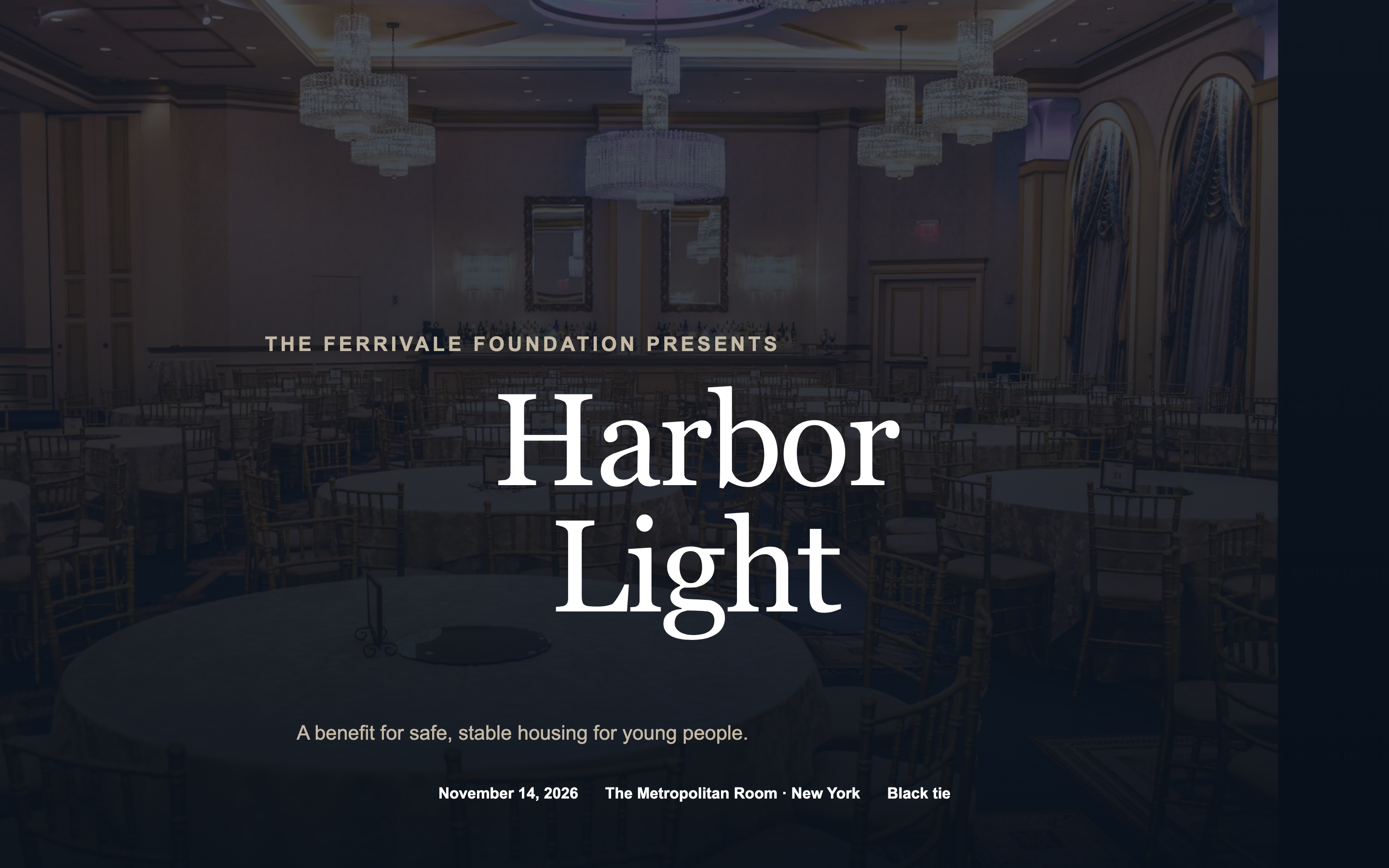
A black-tie benefit page with an honoree spotlight, tiered sponsor recognition, and table pricing — formal without tipping into ornate.
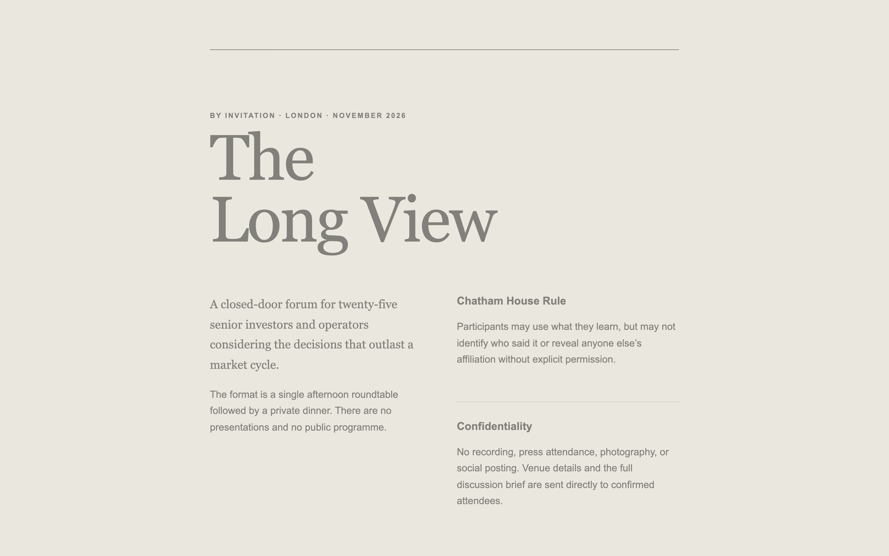
A deliberately low-information page for a closed-door convening — conveys seriousness and exclusivity while revealing almost nothing.
Built something like this on Gatsby? We'd like to feature it.