
Overview
Reporting & Analytics
See RSVP performance, engagement, and guest growth across every event in one dashboard. Numbers that match each event's RSVP summary exactly, filterable by tag and exportable to CSV.
You ran a dozen dinners this quarter. Which invite actually filled the room?
Attendance data usually dies inside each event. You have twelve guest lists and no way to compare them, so the question every partner asks after an event — “did that work?” — gets answered by gut feel.
Reporting rolls every event into one dashboard. Response rates, best send times, which colleagues drive the strongest turnout, and how your guest base is growing — across all of it, at once.
One view, every event
Go to Reporting in the main navigation. It aggregates analytics across all your events automatically. Dateless Lists are excluded, so newsletters and directories never skew your event numbers.
Numbers that reconcile
Every RSVP count uses the same buckets as the RSVP summary on each event’s Guests tab. What you see in Reporting matches what you see on the event, guest for guest. Reporting itself covers invitations and RSVPs across events — attendance for the day itself lives on each event’s own Guests tab.
Dashboard and Table
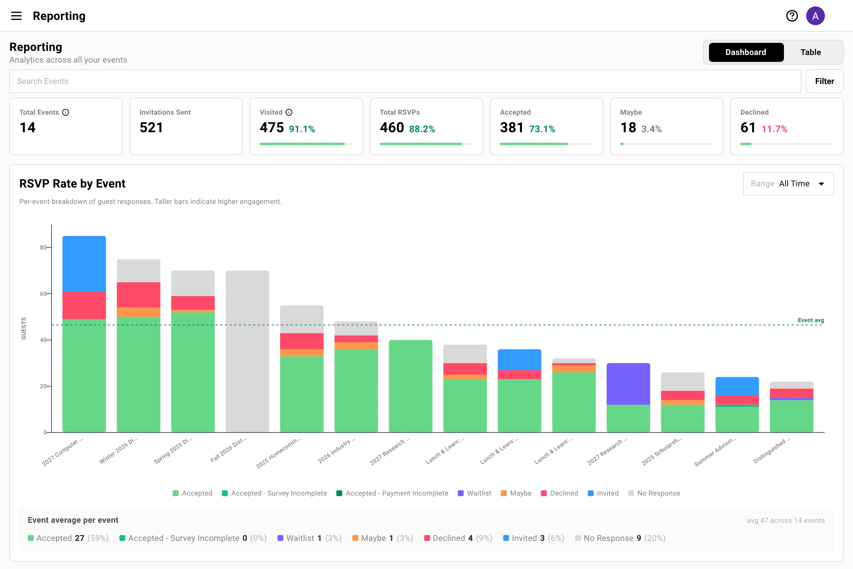
Section titled “Dashboard and Table”Reporting opens on the Dashboard. Switch to Table for a row-per-event view of the same data. Both share the same Search Events and Filter controls at the top, and the Dashboard leads with the headline funnel before its charts.
The top-line funnel
Section titled “The top-line funnel”These load first, before the charts, so the answer to “how are we doing overall” is on screen instantly. Each disposition metric shows both a count and a percentage of invitations sent.
What each metric means
- Total Events: Every event counted in the dashboard. Dateless Lists are excluded.
- Invitations Sent: Total invitations delivered across all events.
- Visited: Guests who landed on the RSVP page. This tracks page visits, not email opens or clicks — those aren’t tracked separately. Shown as a count and Visited %.
- Total RSVPs: Everyone who responded — Accepted, Maybe, or Declined combined.
- Accepted / Maybe / Declined: How responders answered, each with its own count and percentage.
Why 'Visited' and not 'opens' or 'clicks'
Gatsby measures the moment that actually matters: a guest arriving on your RSVP page. Email open and click tracking is noisy and increasingly unreliable across mail providers, so Reporting doesn’t dress it up as engagement it can’t verify. Visited is a real signal — someone reached the page where they decide to attend.
Filter the whole dashboard at once
Section titled “Filter the whole dashboard at once”Search Events and the Filter menu sit at the top of Reporting and apply everywhere at the same time. Change either one and the funnel, every chart, and the table all recalculate together — so the numbers you’re reading always describe the same slice of events.
Search by event name
Type in Search Events to narrow to events whose name matches. Everything on the page updates as you type — useful for pulling up a single series like “Investor Dinner” across every city you’ve run it in.
Filter by event tag
Open the Filter menu and choose one or more Event Tags, then switch between AND (events carrying every selected tag) and OR (events carrying any of them).
This is the real power tool for large accounts: tag your events by region, fund, or program, and you can pull a clean read on just that slice — only your APAC events, only LP meetings, only this year’s roadshow. Untagged events won’t be captured, so consistent tagging is what makes this sing.
Zoom a single chart by date
Some charts add their own Range control on top of the dashboard filters — RSVP Rate by Event and Time to RSVP Response each offer Last Month, Last Quarter, Last Year, All Time, or a custom start–end. Use these to focus one chart on a window without changing the rest of the page.
When a chart still has more events than it can show clearly, it displays your top 25 by volume with a View all in table link — filter down with tags first, or jump to the table for the complete list.
RSVP Rate by Event
Section titled “RSVP Rate by Event”A stacked bar per event shows its full RSVP breakdown across eight status buckets, with a dashed line marking your average total so you can spot the events that over- and under-performed at a glance.
The eight RSVP buckets
Every RSVP status a guest can hold rolls up into one of these buckets — the same grouping used by the RSVP summary on each event’s Guests tab:
| Bucket | Includes |
|---|---|
| Accepted | Accepted (and legacy accepted-incomplete) |
| Accepted – Survey Incomplete | Accepted but the registration survey isn’t finished |
| Accepted – Payment Incomplete | Accepted but payment isn’t finished |
| Waitlist | Waitlisted guests |
| Maybe | Tentative responses |
| Declined | Declined, cancelled, and rejected |
| Invited | Sent, visited, or seen — no response yet |
| No Response | Awaiting, pending, failed, bounced, blocked, and predictions |
Two buckets are conditional: Accepted – Payment Incomplete only appears on events that use paid ticketing (the guest accepted but hasn’t paid), and Accepted – Survey Incomplete only appears when an event has a registration survey the guest hasn’t finished. Most events show neither.
Because Reporting and each event’s RSVP summary read from one shared definition, the counts always agree.
Filtering by date
-
Use the timeframe selector on the chart to pick Last Month, Last Quarter, Last Year, or All Time.
-
Or choose a Custom range with start and end dates.
-
The chart recalculates for the events in that window.
When you run a lot of events
The chart shows your top events by volume — you’ll see a Top 25 of [total] label and a View all in table link when there are more. Click it to jump to the Table view for the full list. The Invite Sender and Guest Source charts cap the same way, so the visuals stay readable while the table holds everything.
The same numbers, on every event
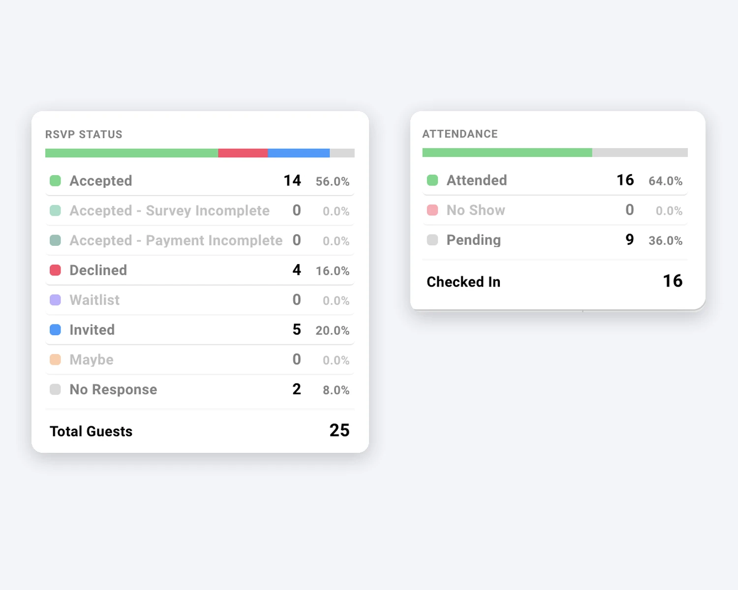
Section titled “The same numbers, on every event”Reporting rolls things up across events — but each event carries the same analytics inline. Open any event’s Guests tab and two live summaries sit at the top: one for RSVPs, one for attendance.
RSVP summary
The RSVP summary breaks the Guests tab into the same buckets Reporting uses — Accepted, Waitlist, Maybe, Declined, Invited, and No Response, plus the conditional Accepted – Payment Incomplete (paid-ticketing events) and Accepted – Survey Incomplete (events with a registration survey) — each with a count and a percentage of total guests. It’s the single-event version of the RSVP Rate by Event chart, and because both read from one shared definition, the numbers match exactly.
Attendance summary
The Attendance summary tracks the day itself: Attended, No Show, and Pending, with a running Checked In count and each as a percentage. This is where per-event attendance analytics live. The cross-event dashboard focuses on invitations and RSVPs, so the event’s own summary is your at-a-glance read on who actually showed. See Event Check-In for how arrivals get recorded.
Response timing
Section titled “Response timing” Invite Interactions by Time of Day
Twenty-four bars, one per hour, showing the share of guest responses that land in each hour of the day. Use it to schedule your next send for when your audience is actually paying attention.
Time to RSVP Response
A cumulative curve showing how quickly guests respond after an invitation goes out — what share have replied within an hour, a day, a week. Switch the range between 12h, 24h, and 7d. A slow curve tells you a reminder is worth sending; a fast one tells you your timing is already working.
Sender and source performance
Section titled “Sender and source performance” RSVP Rate by Invite Sender
For each sending address, a bar shows the unique guests reached and a line shows the acceptance rate. Sort by Guest Count or Invites Sent. This is how you find out that dinners sent from the partner’s own inbox convert at twice the rate of the shared events address.
RSVP Rate by Guest Source
The same view, grouped by who owns the guest relationship — the colleague whose network a guest came from. Rates are capped at 100%, so the comparison stays honest. It surfaces which relationships reliably turn invitations into attendance.
Guest Growth Over Time
Section titled “Guest Growth Over Time”One chart tracks how your guest base is building. Toggle between Cumulative and Per-period to see either the running total or the pace of additions, and between Total and Unique Guests to separate raw volume from distinct people.
Flip to Unique Guests to see how much of your growth is new relationships versus re-inviting the people you already know.
Table view and export
Section titled “Table view and export”Switch from Dashboard to Table for a row per event with every metric in columns. The Search Events and Event Tags filters carry over from the dashboard, so whatever slice you were looking at is already applied here.
Sorting and drilling in
-
Click any column header to sort — by RSVP rate, invitations sent, or any other metric.
-
Narrow the list further with Search Events or the Event Tags filter (the same dashboard controls).
-
Click an event name to jump straight to that event’s Guests tab.
Exporting to CSV
Export the table — in its current sort and filter state — from the menu in the table header. The export carries over whatever Search Events and Event Tags filtering is applied, and dateless Lists are never included since Reporting excludes them entirely. Two formats are available:
- CSV — standard, for any tool.
- CSV (Excel) — encoded so it opens cleanly in Excel.
The file downloads as Gatsby-Reporting-[date].csv.
Common Questions
Section titled “Common Questions” Where do I find Reporting?
Go to Reporting in the main navigation. It opens on the Dashboard, showing analytics across all your events.
Why do the numbers finally match my event page?
Reporting and each event’s RSVP summary now read from one shared set of status buckets. Every RSVP status lands in the same bucket in both places, so the totals reconcile guest for guest — no more explaining why two screens disagree.
Are my dateless Lists included?
No. Reporting covers events with dates. Lists — newsletters, directories, ongoing contact groups — are excluded so they don’t distort your event metrics.
Does Reporting track email opens and clicks?
Gatsby tracks Visited (guests who reached your RSVP page) on the guest list and email opens or clicks per campaign (which mail providers report inconsistently). Visited is the signal you should act on.
Can I report on a single date range or a set of events?
Yes. The RSVP Rate by Event and Time to Response charts have their own timeframe and custom-date controls, and the whole dashboard filters by event name and event tag.
Can I get this data out of Gatsby?
Yes. The Table view exports to CSV and Excel-encoded CSV in your current sort and filter state. For live, ongoing sync of attendance and RSVP data into your CRM, see Integrations.