
Executive Dinner 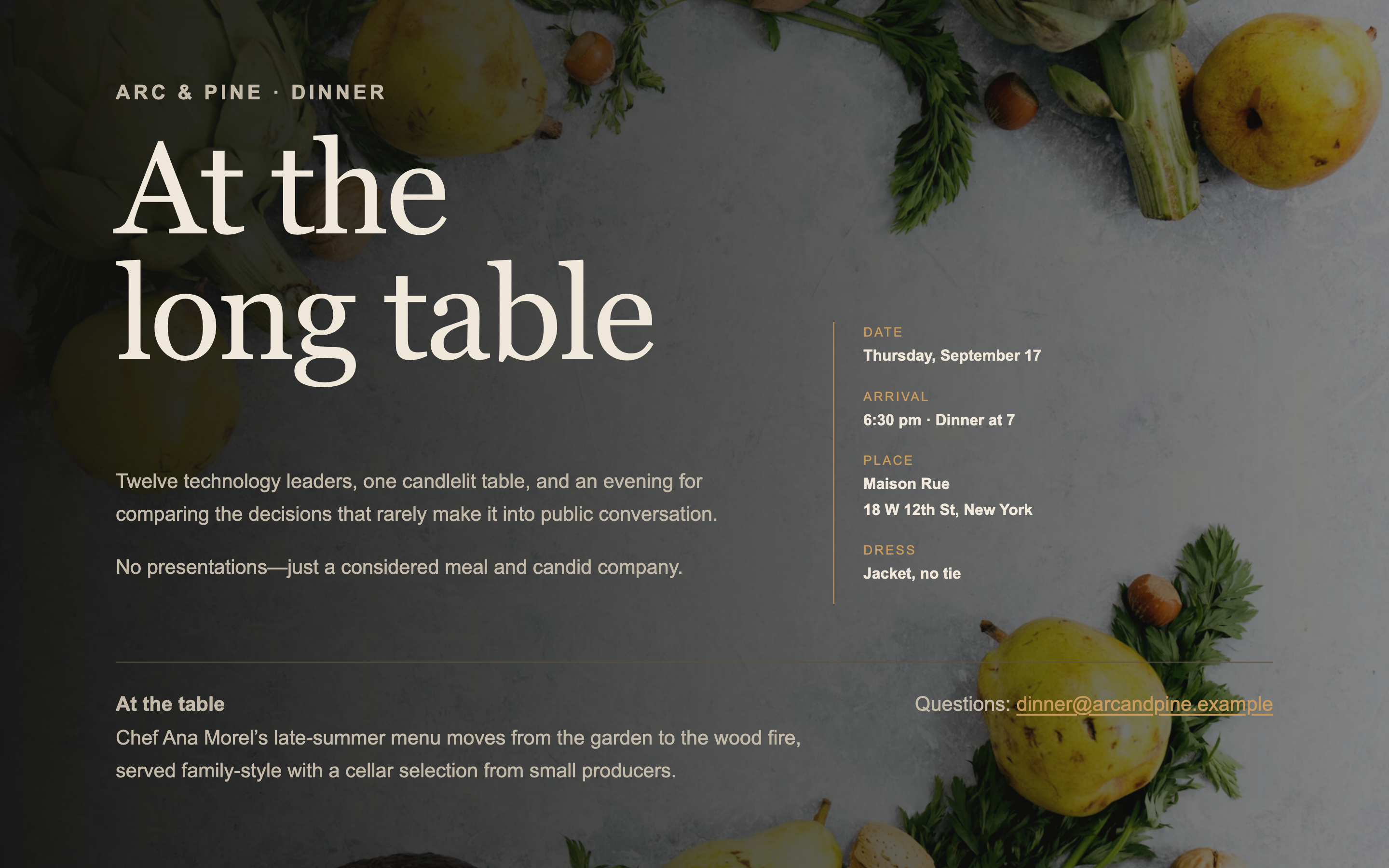
Executive Dinner
A single-screen page for an intimate dinner — venue, chef, and the shape of the evening. No scrolling, no agenda, no filler.
Landing Page Prompts
An energetic page for a founder community event, with a portfolio logo wall — lively without sliding into consumer-app territory.
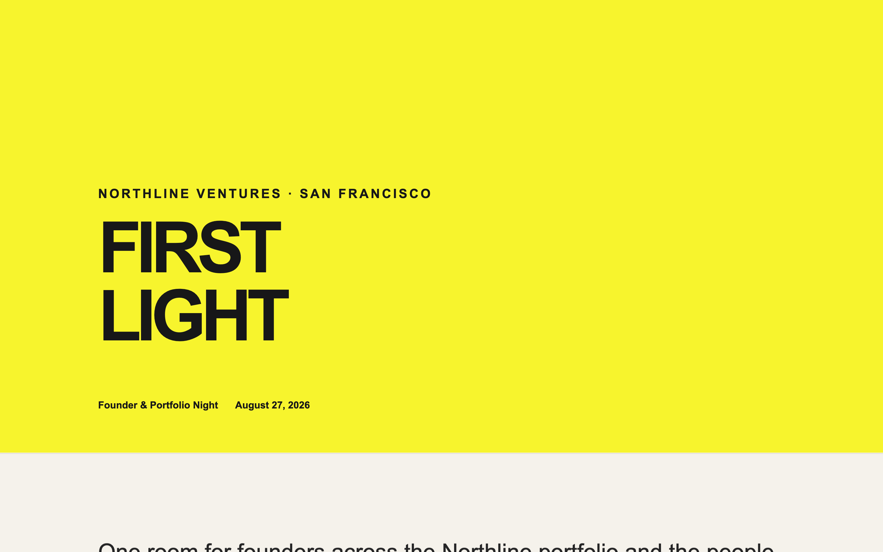
The hardest tonal balance in the set. Too formal and founders won't come; too playful and the firm looks unserious to the LPs who see the same page.
The portfolio logo wall is the load-bearing element — it says who's in the room better than any description.
Create a landing page for [EVENT NAME], an evening hosted by [YOUR FIRM] for founders across our portfolio and network, on [DATE] at [VENUE, CITY].

Sections:

1. A bold typographic hero — the event name set large, with the date and city. Confident and modern. No stock photography of people networking.
2. Two or three sentences on what the evening is: who's coming, what it's for, and what it explicitly is not. If it's not a pitch event, say so — that's the most useful sentence on the page.
3. PORTFOLIO LOGO WALL — a grid of company logos, greyscale by default, coming to full colour on hover. This is the centrepiece. Give it space and let it be large.
4. A loose evening timeline: doors, remarks, the main thing, and an open end. Keep it informal — times and one-line labels, not a conference agenda.
5. If there's a speaker or panel, a compact section with portraits and one-line bios. Keep it small; this isn't a conference.
6. Venue and practicalities: address, nearest transit, dress code stated casually, and whether food is served.
7. A single line on who else will be there — described by type, never by name. "Around 60 founders across seed to Series B."
8. Footer with contact email placeholder.

Design direction: modern, energetic, confident. Strong sans-serif typography doing most of the work. One vivid accent colour, [#HEX], against a mostly neutral palette. Type-led rather than image-led.

The line to hold: lively but credible. No emoji, no gradient mesh backgrounds, no bouncing animations, no confetti. LPs and journalists will see this page too.

Motion: logos fade in on a slight stagger as the wall enters view. Hover raises a logo subtly. Nothing else.

Two requirements that govern how this page will be used:

FIRST — this page will be embedded inside a Gatsby event page, which supplies its own RSVP frame on top of it. So:

- Do NOT include any RSVP button, register button, ticket link, "reserve your spot" call to action, or registration form. Gatsby provides all of that.
- Do NOT include a contact form, a newsletter signup, or an email capture of any kind.
- Do NOT include a sticky header or floating action button that could collide with the RSVP frame overlaid on top.
- Leave roughly 120px of clear vertical space at the very bottom of the page so the Gatsby RSVP frame has somewhere to sit without covering content.

If a section feels like it needs a call to action, end it with a line of text instead — the Gatsby frame is the button.

SECOND — publish it to a public URL that requires no login, no password, and no invitation. I need to open it in a fresh incognito window and see the whole page with no wall of any kind, because it has to load inside an iframe.

Do not enable any preview password, access gate, or authentication. If your platform sets a Content-Security-Policy with `frame-ancestors 'none'`, remove it or change it to `frame-ancestors 'self' https://gatsby.events` — otherwise the page will refuse to load inside Gatsby.

Build requirements:

- Fully responsive, designed mobile-first. Most guests open event pages on a phone.
- No horizontal scrolling at any width from 320px up.
- Real, specific placeholder copy throughout — never lorem ipsum. I need to see how actual text sits in the layout.
- Descriptive alt text on every image.
- Keep it fast. Avoid heavy video backgrounds and multi-megabyte hero images; this loads inside another page.
- Respect prefers-reduced-motion for any animation.
A single-screen page for an intimate dinner — venue, chef, and the shape of the evening. No scrolling, no agenda, no filler.
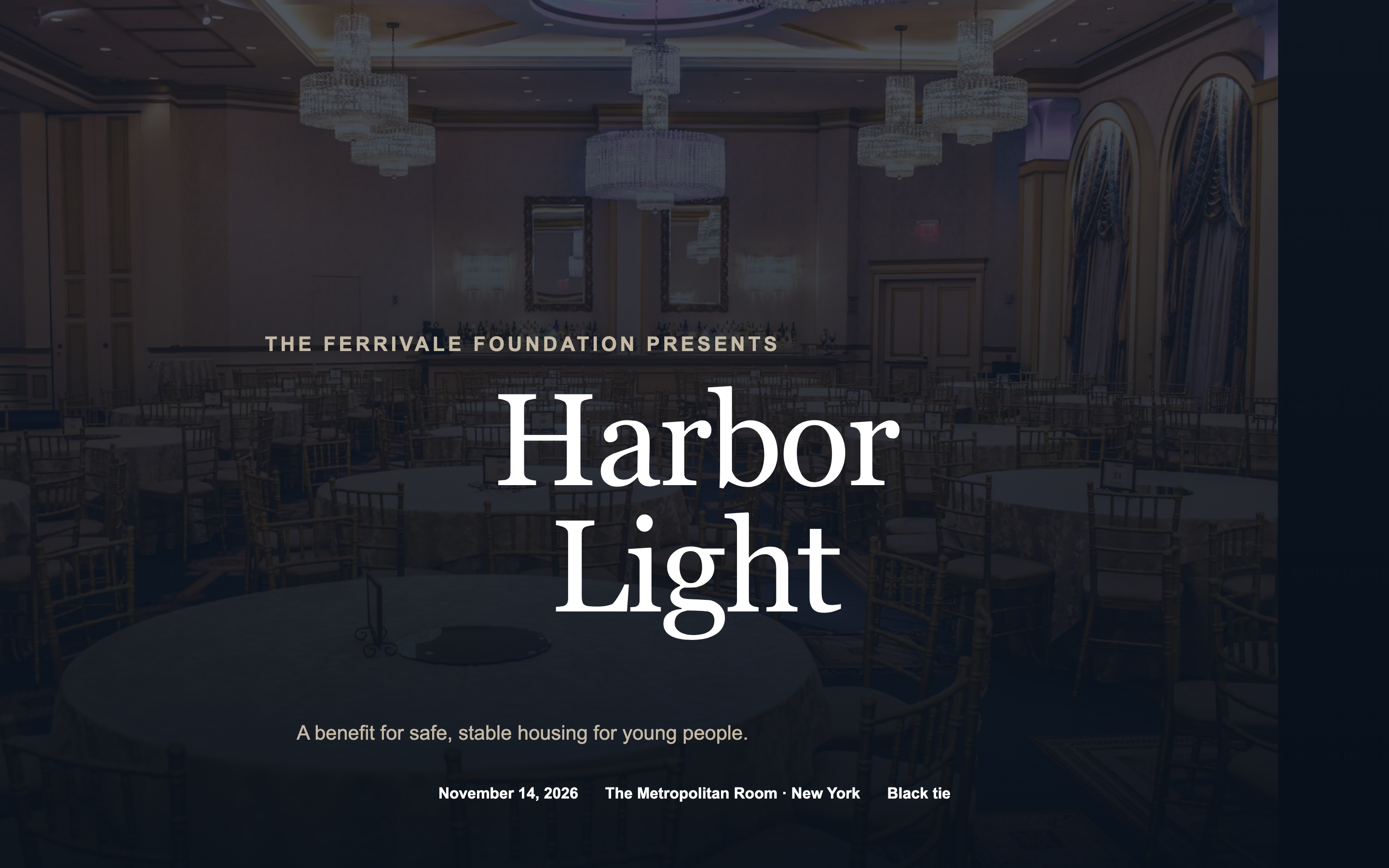
A black-tie benefit page with an honoree spotlight, tiered sponsor recognition, and table pricing — formal without tipping into ornate.
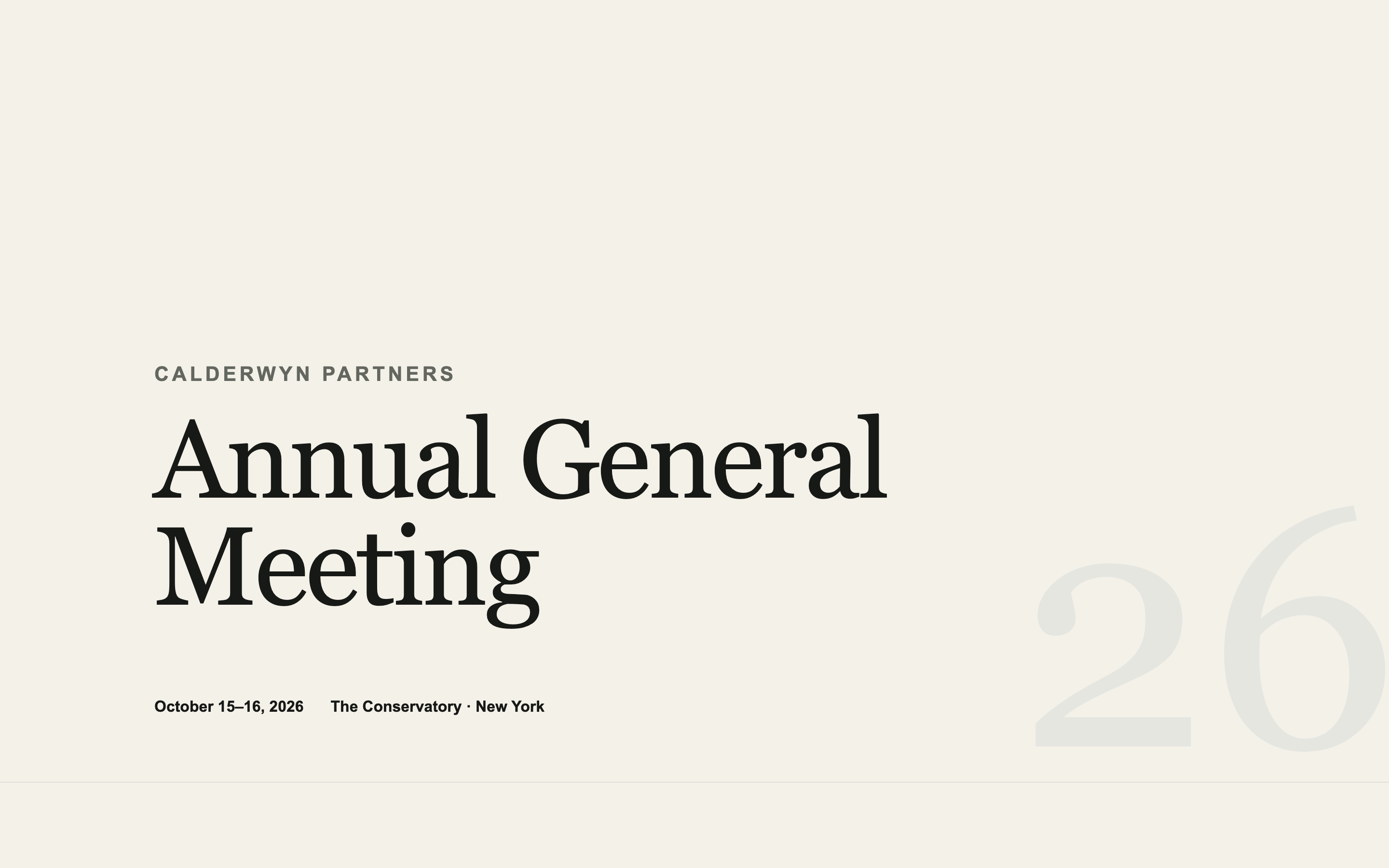
An institutional AGM page — agenda, speakers, logistics, and travel — designed to look like the firm spent money on it without looking like marketing.
Built something like this on Gatsby? We'd like to feature it.