
Internal Offsite 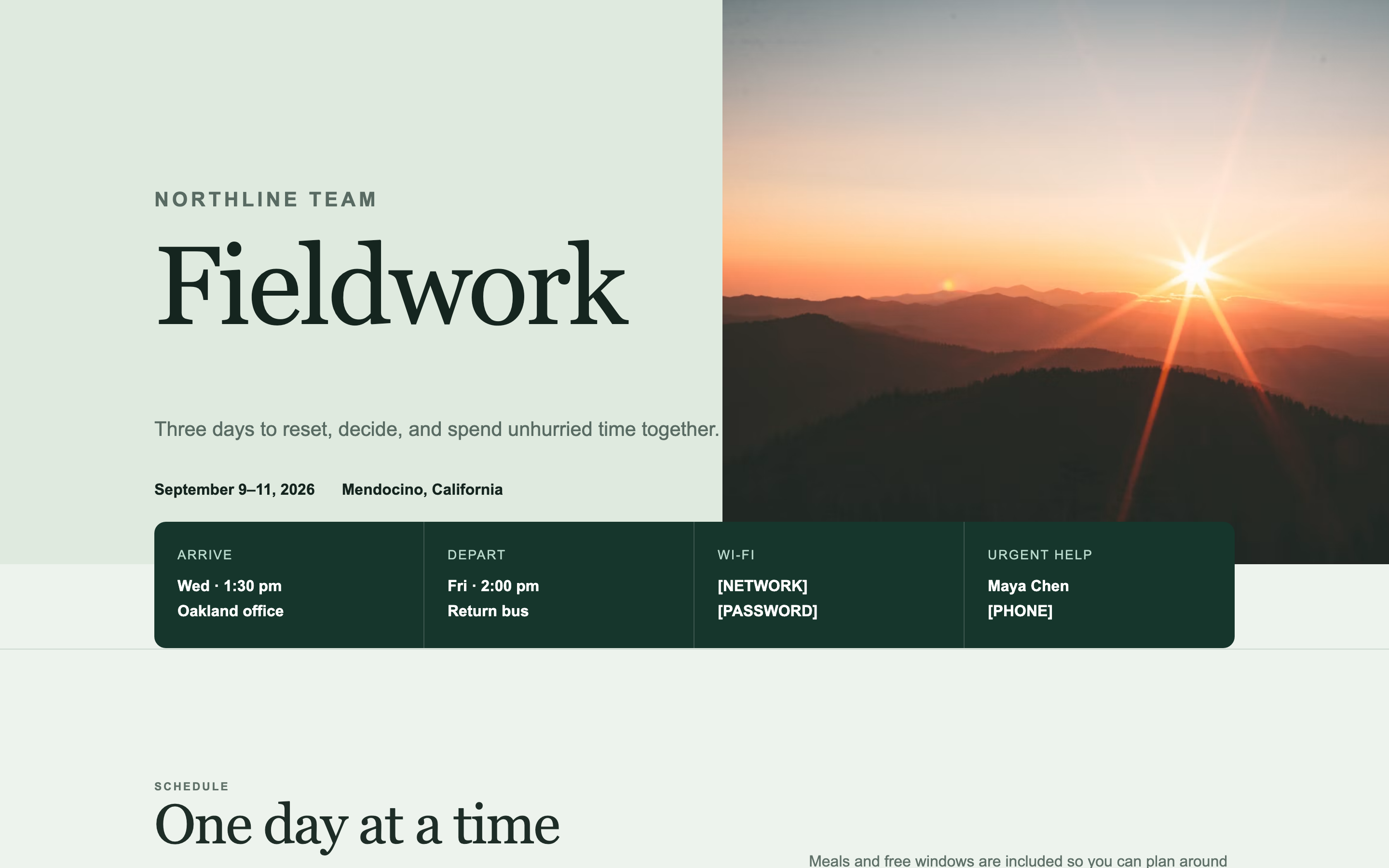
Internal Offsite
A practical page for a team offsite — schedule, travel, packing list, and a map. Built for people who will open it six times on their phone.
Landing Page Prompts
A long-form page with a sticky anchor navigation and scroll-spy — for events with enough content to need wayfinding.
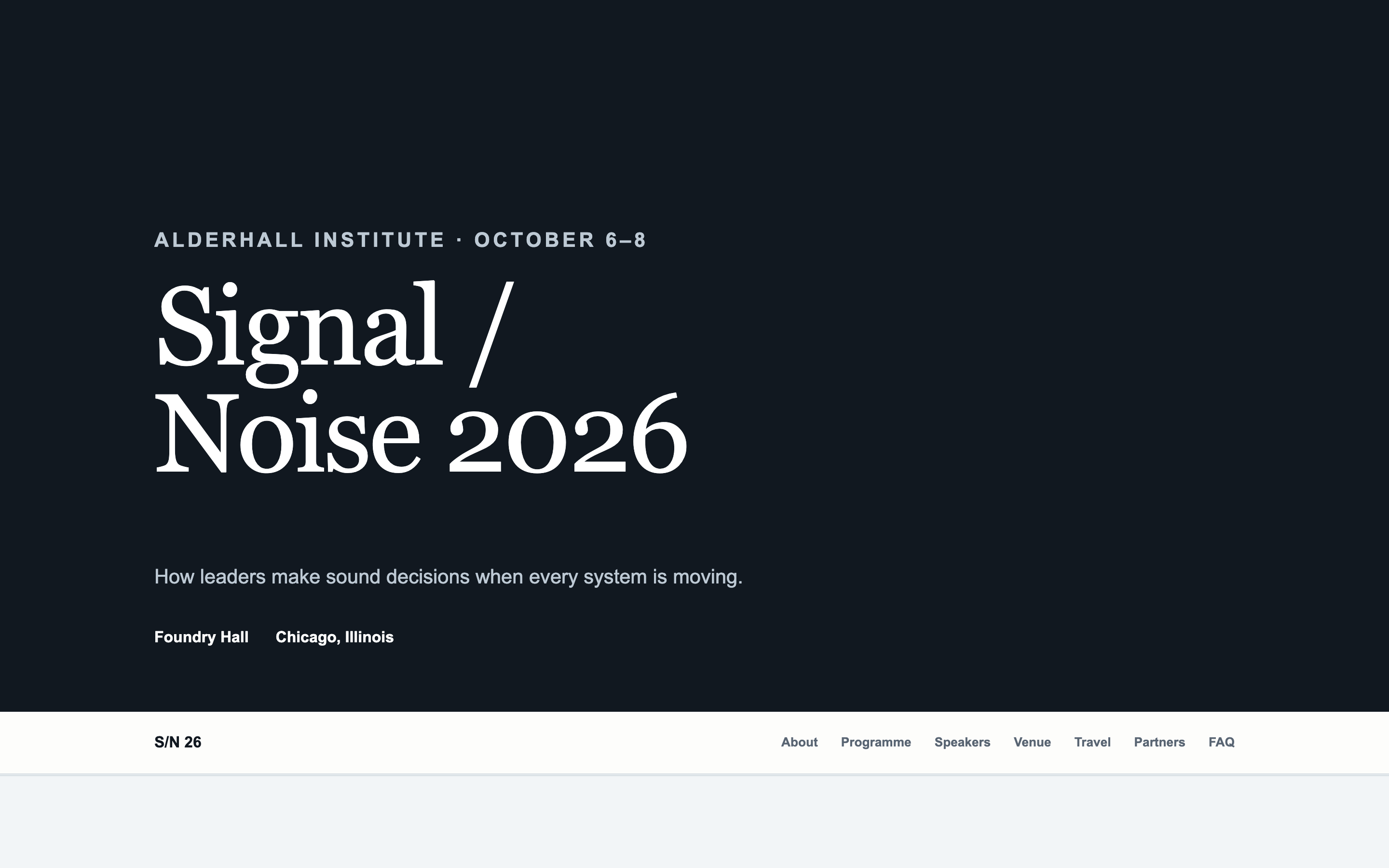
For events with real depth — six or more substantial sections — where the navigation is the actual design problem.
Note the interaction with the Gatsby RSVP frame: a sticky nav plus an overlaid RSVP frame can collide, so this prompt pins the nav to the top only and keeps the bottom clear.
Create a long-form microsite for [EVENT NAME], hosted by [YOUR ORGANISATION] on [DATES] at [VENUE, CITY].

The defining feature is navigation. This page is long, and someone must be able to reach any section in one click from anywhere.

Structure:

1. A sticky top navigation bar, present from the moment the user scrolls past the hero. Anchor links to every section below. The link for the section currently in view is visibly highlighted, updating as the user scrolls. Smooth-scroll on click.
   IMPORTANT: pin the navigation to the TOP only. Do not add a bottom-fixed bar or floating button — a Gatsby RSVP frame sits at the bottom of this page and they will collide.
2. A hero: event name, tagline, dates, location.
3. About — two or three paragraphs on what the event is and who should attend.
4. Programme — the session structure. A timeline or a grouped list, whichever suits the shape.
5. Speakers — a grid with portraits and short bios.
6. Venue — photography, address, a map image placeholder, and getting-there guidance.
7. Travel and accommodation.
8. Sponsors or partners, if applicable.
9. FAQ — eight to ten entries as an accordion.
10. Footer with a contact email placeholder.

On mobile, the sticky nav becomes a compact bar with a menu button opening a full-screen overlay of section links. It must not consume more than 15% of vertical space.

Design direction: [editorial / technical and precise / warm and modern]. Clear typographic hierarchy so each section is unmistakably distinct while scrolling. Alternate section backgrounds subtly — two neutral tones — so the boundaries are legible.

Every section needs a stable id attribute for anchor links, and generous scroll-margin-top so the sticky nav doesn't cover section headings when jumping.

Motion: smooth scroll on nav clicks, and a gentle fade-up as sections enter. The scroll-spy highlight should transition softly rather than snapping.

Two requirements that govern how this page will be used:

FIRST — this page will be embedded inside a Gatsby event page, which supplies its own RSVP frame on top of it. So:

- Do NOT include any RSVP button, register button, ticket link, "reserve your spot" call to action, or registration form. Gatsby provides all of that.
- Do NOT include a contact form, a newsletter signup, or an email capture of any kind.
- Do NOT include a sticky header or floating action button that could collide with the RSVP frame overlaid on top.
- Leave roughly 120px of clear vertical space at the very bottom of the page so the Gatsby RSVP frame has somewhere to sit without covering content.

If a section feels like it needs a call to action, end it with a line of text instead — the Gatsby frame is the button.

SECOND — publish it to a public URL that requires no login, no password, and no invitation. I need to open it in a fresh incognito window and see the whole page with no wall of any kind, because it has to load inside an iframe.

Do not enable any preview password, access gate, or authentication. If your platform sets a Content-Security-Policy with `frame-ancestors 'none'`, remove it or change it to `frame-ancestors 'self' https://gatsby.events` — otherwise the page will refuse to load inside Gatsby.

Build requirements:

- Fully responsive, designed mobile-first. Most guests open event pages on a phone.
- No horizontal scrolling at any width from 320px up.
- Real, specific placeholder copy throughout — never lorem ipsum. I need to see how actual text sits in the layout.
- Descriptive alt text on every image.
- Keep it fast. Avoid heavy video backgrounds and multi-megabyte hero images; this loads inside another page.
- Respect prefers-reduced-motion for any animation.
A practical page for a team offsite — schedule, travel, packing list, and a map. Built for people who will open it six times on their phone.
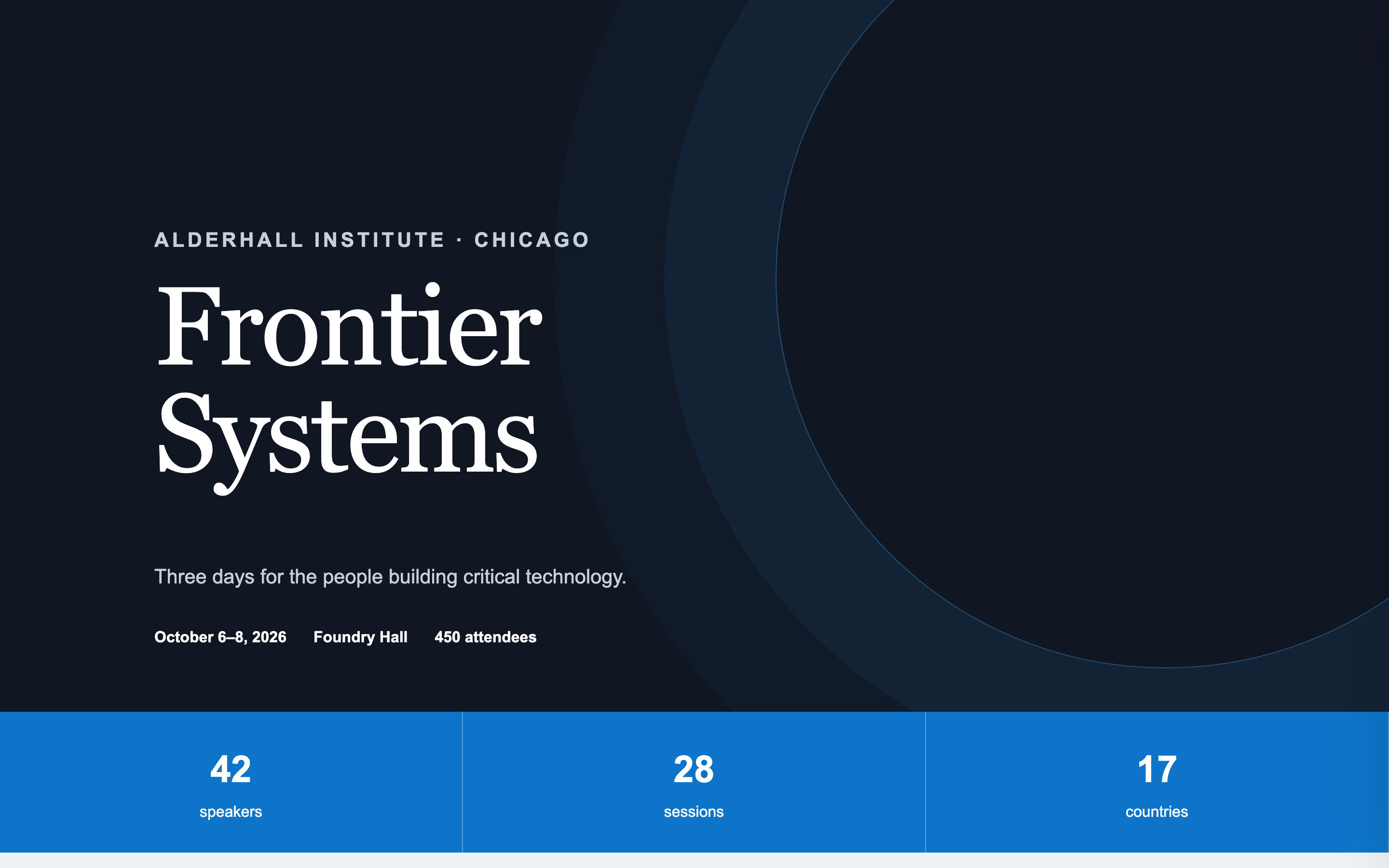
A conference page with a day-tabbed agenda, speaker grid, sponsor tiers, and venue map — the format that handles genuine complexity without becoming a wall.
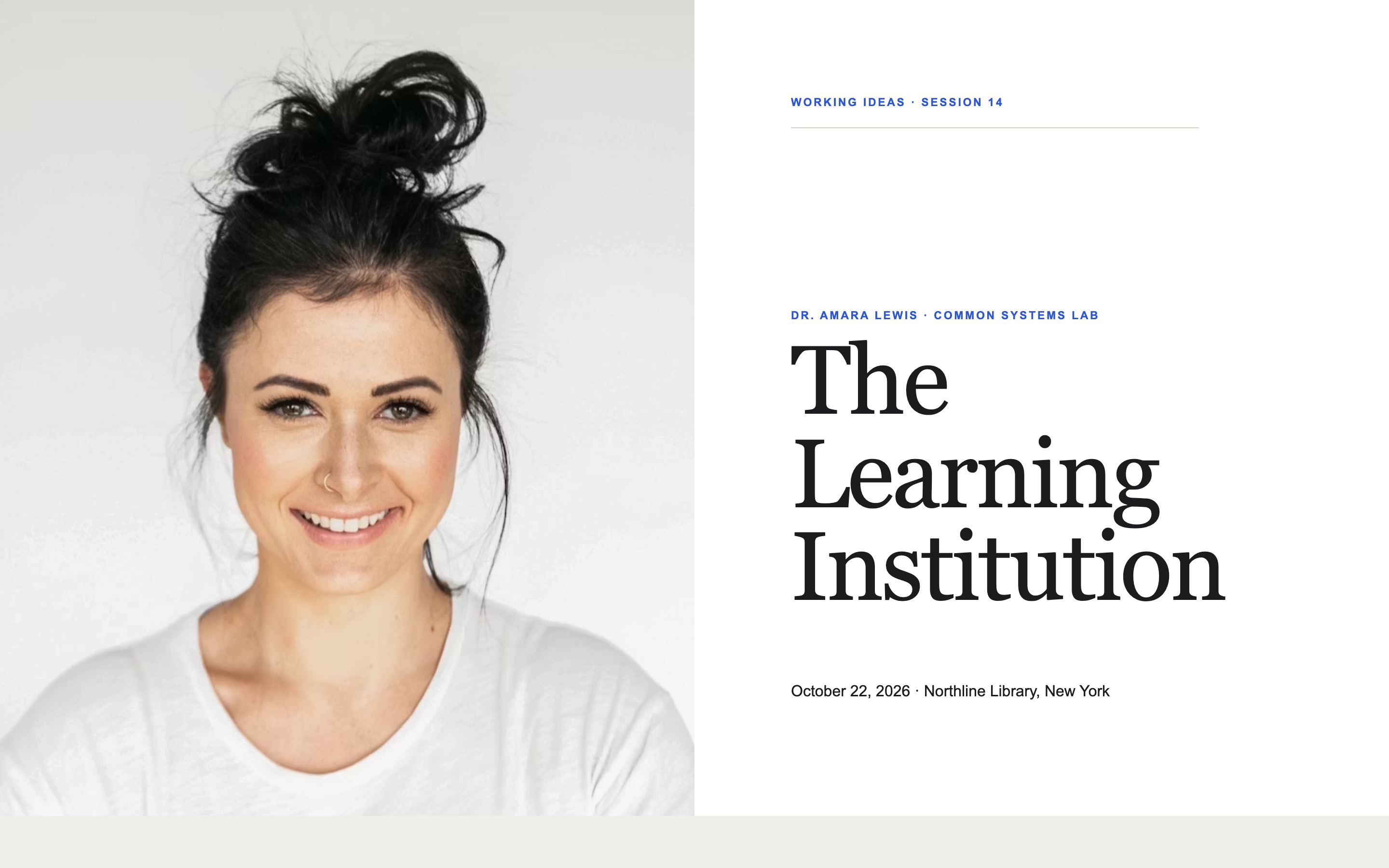
A page for one session in a recurring series, with a past-episodes strip that makes a single event feel like an institution.
Built something like this on Gatsby? We'd like to feature it.